

Sharing design tips for non-designers might be a baffling choice, but making smart design choices regardless of your preference for visual design might just be the thing that’s going to transition your business from “whatever” to “the algorithm loves you, and so does your audience”. According to research, our eyes are responsible for over 80% of the information we receive through our senses. Your design is the first thing your prospects will see, and it will play a major role on the first impression they’ll have of your business. If this impression is good, they will seek out more from you, like what you offer, what are the benefits of using your products or services, extras, terms and many other things. If the initial impression is bad though, the rest of your efforts will be in vain.
We can’t provide a complete guide on how to create a visually-compelling brand identity and assets in just a one blog post. But we can provide you with some valuable pointers. Even if you’re not ready to hire a professional designer, these tips will help you to make a good first impression. It won’t be very difficult either.
Designing your brand should be a fun process, and we suggest you look at the latest trends to give you some guidance on graphic elements, fonts, colors, styles.
Are you ready to start? Let’s go!
Fonts
First, we will learn about fonts because they’re the first thing we consciously read, and they can be more expressive than you might think.
Technically, fonts are shapes in our minds, and these shapes help us communicate and express ourselves in every aspect of our daily lives. And believe it or not, fonts can trigger feelings and emotions in our bodies. If you want a good example, look at the Coca-Cola logo; what do you feel when you see it? Some curvy fonts can trigger feelings of fun, happiness, and organic feeling because of all the movement going on.
When choosing the right font for your brand ask yourself questions like the following:
What’s your brand’s personality? What qualities are essential for your brand?
The typeface world is divided in many options but the most important are the serif and sans-serif. The difference between them is the use of strokes to end the letter, serif use strokes for a more formal style, and sans-serif use no stroke for a simpler style.
Let’s look at the details.
Serif vs. Sans-Serif
- Serif: The best way to describe this typeface is to think of the ancient Greeks and Romans because they were the creators of this style and it has survived for millennia.
Thanks to its origins, nowadays this typeface gives an impression of class and tradition. It also gives the feeling of trust and respect. Serif fonts are very commonly used by financial institutions, insurance companies, universities, broadsheets, and editorials.
Some people say to use it as a body copy because this typeface is a good option for readability on a small scale. But don’t limit yourself.
- Sans-serif: Sans-Serif literally means without stroke. This style is super easy to read, clean and modern. If you’re using it for your logo it can give a sense of serenity and honesty. Sans-serif works perfectly everywhere, especially for headlines.
This style gained renown in the tech world for its simplicity and minimalism, and now other industries are switching to this clean typeface.
So, now that you know more about the main typefaces we have some advice for you when getting started.
Usage
- We strongly recommend using a maximum of three typefaces; one for the headlines, one for sub-headlines, and one for the body copy.
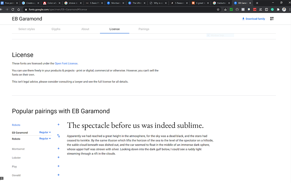
- If you’re downloading free fonts make sure you read the “README” document that comes in the folder. For example, in the Google Fonts website, all the fonts are licensed. You can find this information at the end.
- In web projects, If you can’t find or upload your fonts to the platform, make sure you select fonts that are similar to the ones you have been using. This will ensure brand consistency and keeps your brand recognizable to your audience.
Swatches
Color is the second topic we choose because it’s a key factor in design and helps us to establish our brand.
Colors alone or in combination with other colors can make us feel power, sadness, excitement, etc. We can identify with colors, and they give meaning to our experiences, too. When combined with shapes or words it begins to get interesting for branding and marketing purposes.
If you have done your homework about competitors and looked at their logos you can notice colors that are predominant in your industry. Don’t use the same colors your competitors are using, instead find the colors that match the identity of your unique brand.
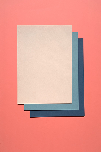
When selecting colors we suggest keeping logos with a maximum of three colors and five to six colors for your palette (two strong, two medium, and two soft colors). If you need help on this quest check these awesome websites.
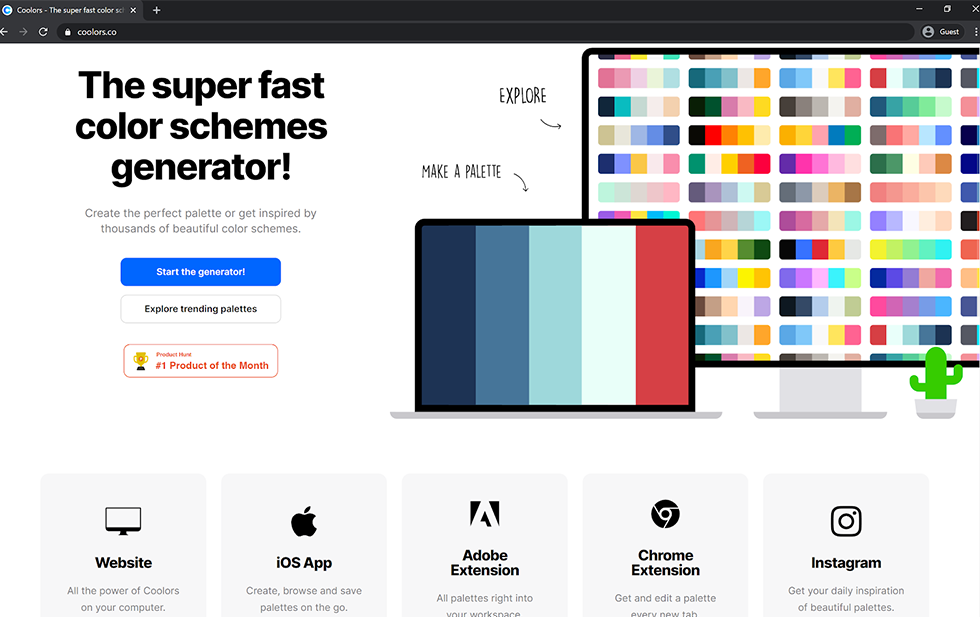
- Coolors (https://coolors.co/)
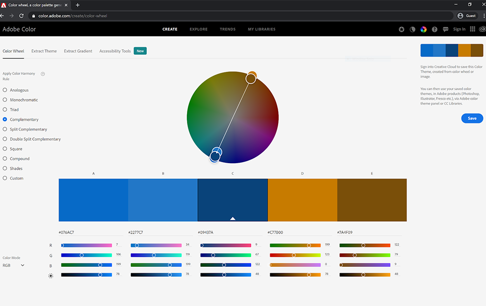
- Adobe Colors (https://color.adobe.com/create/color-wheel)
Color palettes are used everywhere. Smart businesses understand this and stick to their core colors, instead of jumping all over the spectrum.
Space
Our third topic is Space, or as we call it in the design world white or negative space.
So, imagine arriving at a place where you feel claustrophobic, or there isn’t much space to move around. Not a great feeling, right?. Just like in real life, in the design world, we need space for our image to breathe. It’s not always necessary to occupy every bit of white space with colossal text and massive imagery. Having the right amount of space is crucial for visibility and readability.
 In your next project, when you have all the graphics, images, and text, try to resize the objects and elements, increase or decrease your font size and play around until you find the right balance until it looks visually appealing. Always ask people their opinion and If you need more help, check your competitors and see how they apply the negative space to their latest communication or products. Get inspired!
Ultimately, space helps create an environment of balance and quality in your documents, and products.
Another important design tip for non-designers is Alignment because messy design isn’t good for your eyes, your brain, or for your business.
Alignment is everywhere. If you start analyzing your surroundings you’ll notice at a movie theater seats are perfectly aligned, the parking spots at the supermarket are neatly arranged, Amazon product images are aligned with the description, your Word document paragraphs all line up in the same place and so on.
In design, alignment connects objects even in distance, communicating the idea of belonging. It helps us to keep things balanced and visually appealing.
Moodboard
If you’ve ever made a collage for any school assignment then you’ll love our fifth topic, the mood board.
A mood board is the starting point for every creative project. Here is where we add and gather everything we think is necessary for the project; words, ideas, color swatches, fonts, evoked images, graphic elements and objects you like, etc. You can add whatever you think makes sense. Sometimes you will narrow all this information down to a few pictures, words and graphics.

Nowadays you don’t need to go old school, we have options in the digital world that can work well and to speed up our creative process:
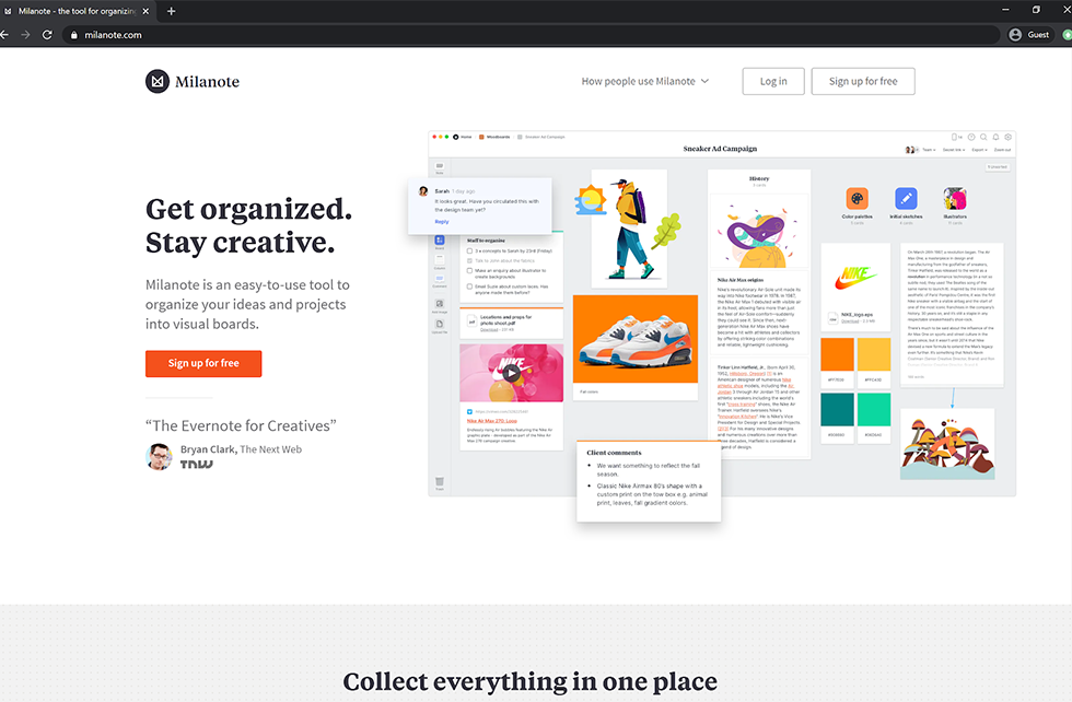
- Milanote (https://milanote.com/): It is a free platform that works in every browser, it has its own library and template to help you get started.
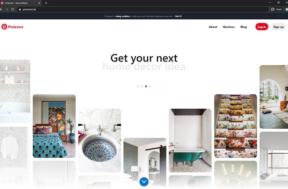
- Pinterest (https://www.pinterest.com/): It’s one of the best social media out there where you can create or plan a mood board and pin your images, add people, and share it.
These are two great digital tools but if you have the time, you can create a hand-made physical mood board out of materials at hand.
What we’ve covered here is just the tip of the iceberg. With that in mind, our five design tips for non-designers should give you a good idea where to move with visuals for your business. And who knows, maybe you’ll get hungry to learn more about design too!