Careful Feet Digital worked with My Lifeline, a cold brew CBD coffee company, to build upon its initial branding work, creating a high-quality visual brand that sets it apart from its competitors both on store shelves and online.
approach
My Lifeline already had a logo that had been tested and received feedback, but no other brand elements were clearly defined and built out. Therefore, CFD was tasked with creating a strong visual brand identity based on the already-designed My Lifeline logo.
results
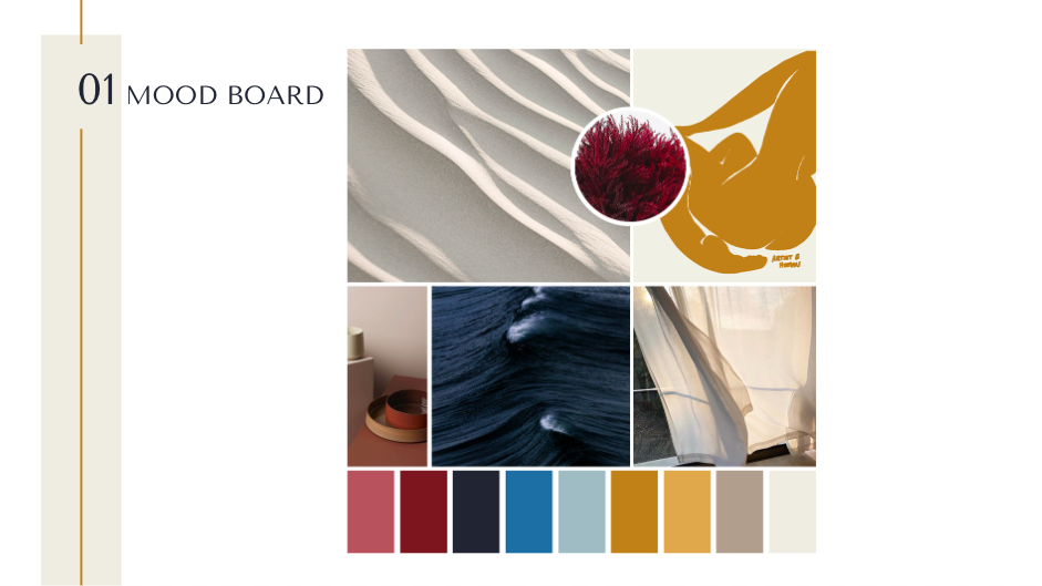
Because the main logo of My Lifeline had already received strong testing, CFD wanted to build a more cohesive visual language surrounding it to support the brand’s high-end wellness aims. By updating the typefaces, building out a robust color palette, and creating a wordmark that could be used in places where the main logo wasn’t appropriate, CFD created a foundation off of which all future visual decisions could be made.
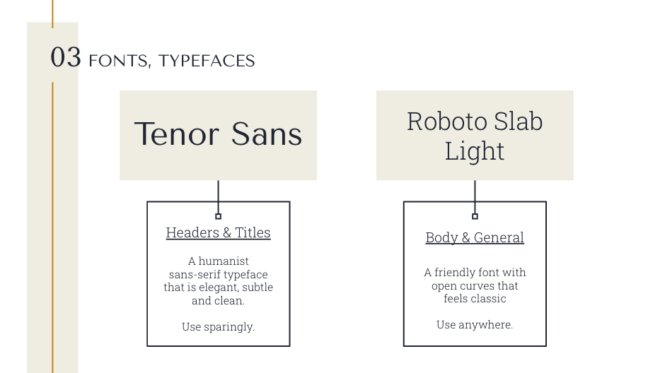
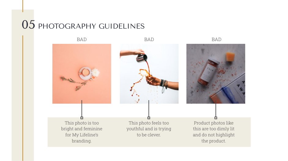
It was important that CFD create guidelines for appropriate usage in order to build brand awareness regardless of where the branding was being used. So, CFD developed a brand book to pass along to the client, giving them all the information they’d need going forward.
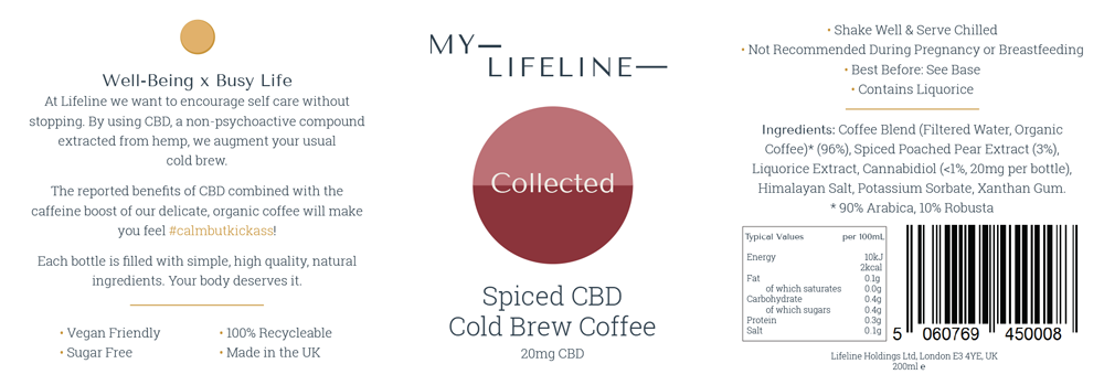
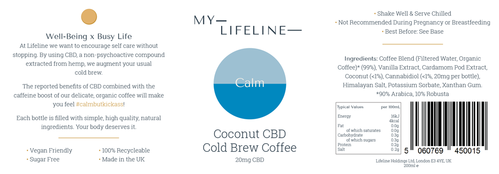
CFD applied the updated branding to the existing product label, which created a seamless transition from the branded web experience to the tangible product. The result was a streamlined, luxe product that stood out amongst other products of its kind.
MyLifeline is available in health food stores across the UK and online. The updated branding sets it apart from other drinks available in shops and has contributed to its commercial success.