
The first recognizable social media site, Six Degrees, was created in 1997 and since then, the speed at which social media changes, pivots and updates has grown exponentially. Frankly, if it were not my job, I don’t know how I would keep up.
There are thousands of articles written about social media best practices and how to grow audiences and engagement, but what I see significantly less of are articles that address the overall visual consistency that defines a strong brand on social media. This is crucial in building a recognizable visual presence that resonates with your audience – this is called brand recognition and it’s an essential part of converting new customers or clients. According to this GoRollick article, “about 59% of shoppers prefer to buy new products from brands that are familiar to them, which also creates a conversion, but builds a certain degree of brand trust.” As you can see, a strong, recognizable brand is the first step in creating a successful brand.
Social media is a great place to start executing a visual strategy (outside of your website, this should be step number one). This is partly due to the rapid iterations that can be executed on social media but also because 50% of the world’s population is on social media and 43% of internet users use social media when researching things to buy, so it’s a great place to connect with current or potential customers/clients.
How can someone do visuals wrong?
When we say “social media visuals” we are referring to the images, videos and graphics that you post on social media. There are 3 main issues that arise for brands as they execute a visual strategy on social media:
- Inconsistent Color Palette
- Low Quality Images
- Overuse of Stock Images
- Off-brand graphics
Any one of these on their own can remove a user’s ability to recognize your brand in an instant and, considering that the average person scrolls the height of Mount Everest in a year, instant recognition is a key to success.
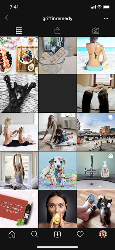
Inconsistent Color Palette
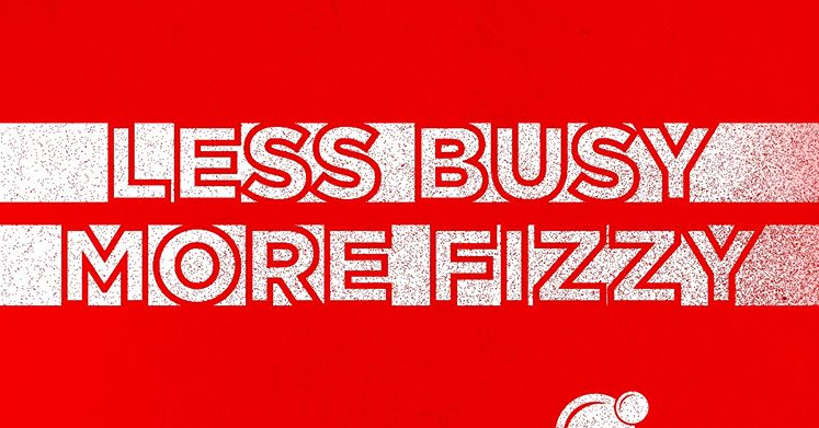
If you have ever followed brands like Coca Cola or Recess on social media, it’s likely that at one point or another, you scrolled past their post and knew it was theirs without ever having to look for a handle or username – that is thanks to color. See what I mean?
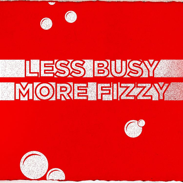
While many brands don’t rely quite so heavily on their brand colors, Coke and Recess are a testament to the importance of consistent color usage in your visuals. Your unique color palette helps followers identify you. They also help convey your brand values through color psychology – want to appear trustworthy and calm? Incorporate blue into your palette!
As a small business owner, there are a lot of things that might not be achievable, such as custom photography or tons of video content, however, consistent use of your brand colors is something that everyone can achieve.
Low Quality Images
I know custom photography is pricey and is definitely not something that businesses on a shoestring budget are likely to invest in, but the good news is that you are not alone and there are plenty of sites that are dedicated to helping you fill this void – some of them are even free!
Sites like Unsplash and Pexels have been around for a little over 5 years. They popped up right around the time that the expectations on brands shifted to daily unique content creation. Since then, I have definitely seen brands and small businesses revert to less frequent publishing, but regardless of how frequently you are publishing content, you want to make sure that you include high quality visual content, which includes photos.
There are a few keys to finding great photos on free sites like the aforementioned Unsplash and Pexels. First, avoid any sort of “filtered” look. Many of the images that exist on free or paid sites have effects added to them. When you are not adding these effects in-house, you have no control over them, which can cause major inconsistencies in your visual presence. You can see what I mean here:
Second, make sure the overall look and feel of the photos you are choosing is consistent. Don’t use a hyper-modern, minimal photo on Monday and then use a country home photo on Thursday. It confuses your followers and does not clearly communicate your brand’s visual aesthetic. As you can see here – these photos do not convey a strong, consistent message:


Lastly, make sure you are using the high-resolution version of the image – do not take screenshots, or resize the image until it is pixelated. This is the quickest way to degrade the quality of your visuals.
Paid sites like Shutterstock, iStock and Fotolia (now Adobe Stock) typically allow you to choose which size and resolution you download the image at, but my personal experience is that some of these images look very much like stock images, they often lack personality or context (think women laughing alone with salad).
Overuse of Stock Images
Overuse of stock photography is something I see often. The result of overusing stock images is that your visual presence lacks authenticity and a unique brand aesthetic, like this:
My rule of thumb with stock photos is that if you are adding a treatment (such as text or another graphic element) to them to make them feel branded, you can use them ⅔ of the time. If you are just publishing the stock image alone with no treatment, you can use them ⅓ of the time that you post.
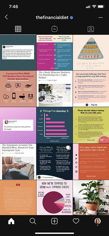
Off-Brand Graphics
Sure you are on a shoestring budget, but it doesn’t have to look that way. Creating a consistent graphics experience for your brand streamlines your workflow and creates a consistent aesthetic for your brand. While there are plenty of apps that allow you to create graphics, the issue is that they often are not easy to recreate and repurpose. As you can see – not using cohesive graphics overwhelms the user and makes it unclear who you are as a brand. While each of these graphics individually, are high quality, when they are placed together in a feed, it looks chaotic:
Imagine you are a selling soap and you want to post customer testimonials to showcase how great your soap is. You first plan to post them on Instagram, so you use an app like Over or A Design Kit to create a visually appealing customer testimonial. While the outcome might look great, they have limited fonts (sometimes you can pay for more fonts), so your brand fonts might not be available. As well, some apps don’t allow you to export the file as more than one size, which means that you would end up having to use something else for an Instagram Story post OR you would have to recreate that graphic multiple times in the app.
If you don’t have a design eye, but you want templates that look great for cheap, I would suggest purchasing them from a site like Creative Market or Etsy. This allows you to pick and choose a bundle of templates that has the appropriate sizes for Instagram Stories and an Instagram feed post, for instance. Many of them can be delivered in the format of your choice. One disclaimer here – you will likely need Photoshop or Sketch to use the files. Because of the file formats, the templates will be customizable meaning you can edit the font and colors.
The great thing about templates is that they will help to streamline your workflow and will keep your visual presence consistent.
No matter what type of content you are publishing or where you are publishing it, maintaining a strong visual aesthetic is an essential part of any successful brand. Recognition means awareness and familiarity with your brand – this is key for getting users into the marketing funnel and moving them along.
At the end of the day, how you represent your brand is a huge decision and one that is multi-faceted, but taking a strategic approach pays off in the long run, as you are carefully considering what you are conveying through your brand aesthetic. How you visually present yourself to the world will likely change over time and that’s ok! As long as you stay true to your core values and keep things visually consistent, your followers, customers and potential customers will stick with you on the ride.